UI/UX design for conversion is about making users act fast. In 2026, attention spans are short. Visitors decide in seconds whether to stay or leave. They judge a site visually before reading a single word. It’s not about trends or fancy layouts. Every button, colour, and space guides behaviour and builds trust. Good UI removes friction; bad UI creates doubt.
At Webmatrik, we combine UX design principles with CRO thinking to deliver results that impact leads, sales, and ROI. In this blog, you’ll see how psychology shapes UI decisions and what design choices drive real conversions.
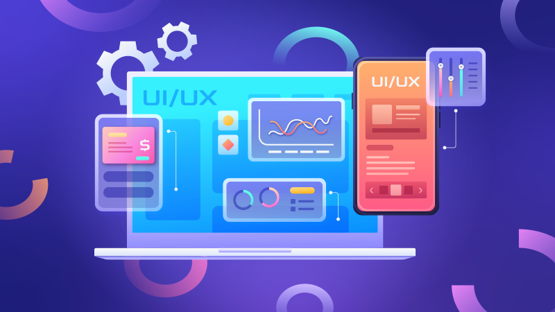
UX and UI: What Is the Difference
UX is how a website works. It focuses on usability, navigation, flow, and user satisfaction. UI/UX design for conversion is how a website looks and interacts. It includes layout, colours, fonts, icons, and animations.
Think of a store: UX is how easy it is to move around. UI is how clean and clear the signs feel. Together, UX and UI guide decisions. They reduce hesitation and improve conversions. At Webmatrik, we understand website design trends in 2026 and create interfaces based on real behaviour to make every action count.
How UI Colors and Designs Influence Conversions: 6 Best Practices
In this section, we break down the exact psychological principles behind UI design for conversion. Using UX design principles, you can reduce hesitation, guide attention, and shape decisions that drive measurable results.
1. Cognitive Impact
Cognitive load is the mental effort users spend on a website. Too many choices, cluttered menus, or confusing layouts make users pause. Smart UI UX best practices simplify navigation, use clear headings, and keep page structures consistent. This removes friction, so visitors never feel lost. The easier it is to understand, the faster they act and convert.
2. Fitts’s Law
Fitts’s Law says targets that are easier to reach get clicked faster. Bigger, closer, and clear buttons boost actions. Make sure users can find main actions instantly. Test button size and spacing across all devices for best results.
Things to remember:
-
Buttons are large enough to click easily
-
CTAs are placed where the eye naturally travels
-
Primary actions are visually separated and obvious
3. Hick’s Law
Hick’s law says that too many options confuse users and slow action. Choice paralysis can happen with multiple pricing tiers or crowded headers. Smart CRO design strategies limit visible choices and show only what’s needed.
Solutions to apply:
-
Use progressive disclosure for extra options
-
Show two to three paths at a time
-
Guide users to the next step clearly
4. Visual Hierarchy
Users usually scan a page first, then decide to read. Visual hierarchy guides attention better than flashy design. It makes key elements obvious and easy to follow.
Key elements of visual hierarchy:
-
Contrasting font sizes
-
Clear headings
-
White space
-
Strategic use of colour
A well-planned hierarchy naturally leads users toward conversion and action.
5. Psychology of Colors: Triggering Trust, Urgency, or Hesitation
Colors influence how users feel and act. Blue signals safety and trust, while red creates urgency. Colours must match brand identity but always test for conversion. Ask yourself: Does this design create clarity or hesitation?
6. Social Proof & Trust Signals: Removing Risk From Decisions
Users want proof they aren’t the first to act. Without reassurance, risk feels higher. Smart UX optimization for websites uses trust elements to guide confidence.
Key trust signals to include:
-
Testimonials and reviews
-
Trust badges (SSL, payment partners)
-
Client logos
-
Clear privacy statements
Every trust element plays a role in user decisions and boosts conversions naturally.
How Webmatrik Use UX Design For Conversions
Every UI/UX design conversion starts with understanding user behaviour. At Webmatrik, UX and CRO strategies are behaviour-backed, not guesswork. We track heatmaps, funnel movements, scroll patterns, and time-on-page to see how users navigate your site.
This data shows where friction occurs and what stops conversions. Our UI UX design services in UAE turn insights into action that drives measurable results.
How Our Targeted Improvements Helps in Conversion
Webmatrik uses data to make targeted changes that boost engagement and conversions.
Key actions include:
-
A/B testing variations: CTA buttons, form lengths, headlines, icons
-
Sticky CTA bars for constant visibility
-
Progress bars on forms to reduce abandonment
-
Hero images & click-to-scroll cues to guide attention
-
One-column forms for faster completion
Our team focuses on even small improvements in UX optimization for websites lead to measurable shifts in engagement.
Book your free consultation today and let our experts guide you!

Request a free quote
We offer Professional SEO services that help websites increase their organic search score drastically in order to compete for the highest rankings even when it comes to highly competitive keywords.
Contact now